Abstract House | Matt Gibson Architecture and Design

  • Abstract House | Matt Gibson Architecture and Design
  • December 2016
  • ARCHITECT Matt Gibson Architecture and Design
  • PHOTOGRAPHY Shannon McGrath

Matt Gibson Architecture and Design: abstract composition

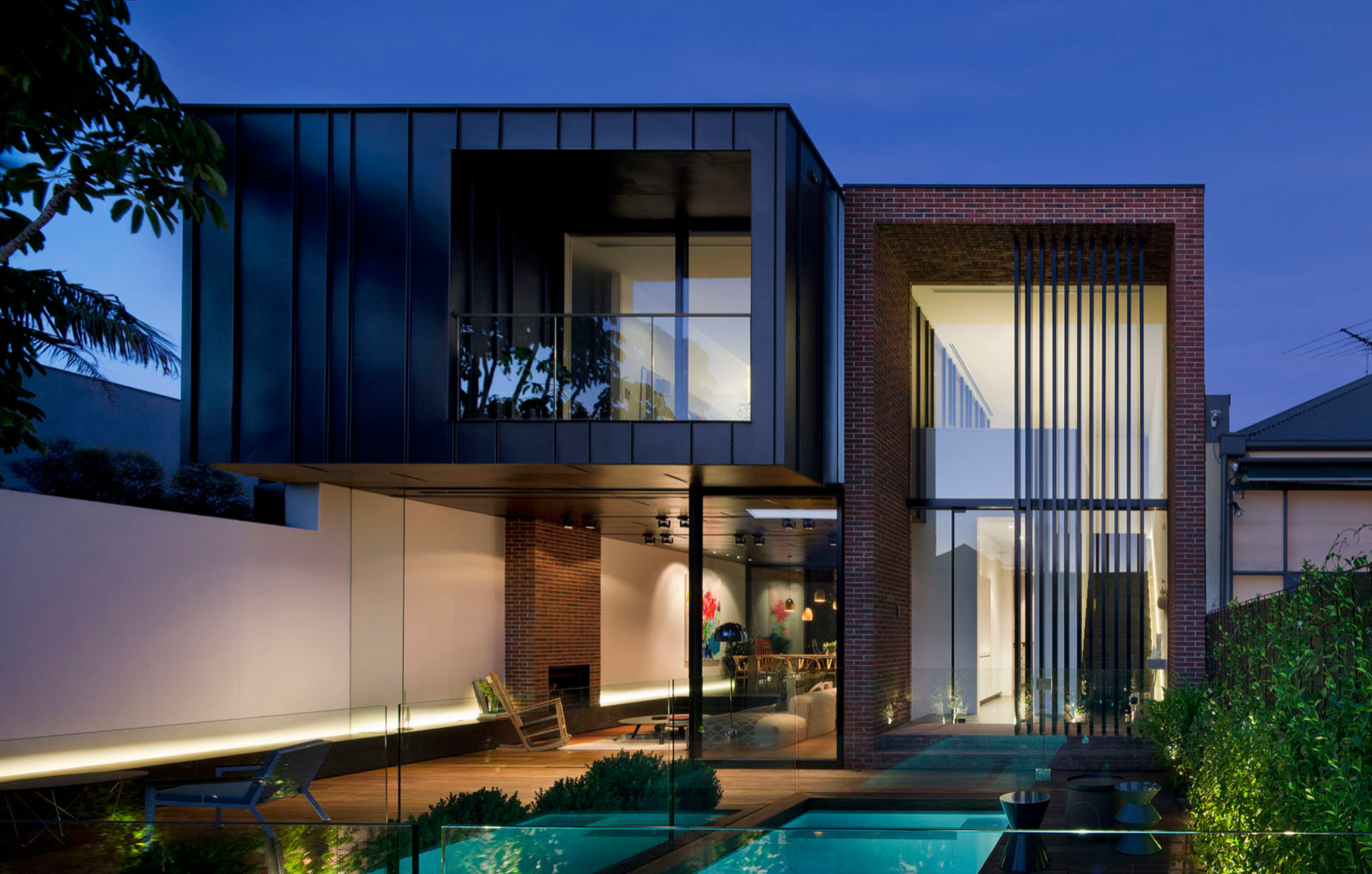
Combining the old with the new is a given when designing in major Australian cities. Heritage overlays are an integral part of architecture and design, but it takes stamina and sensitivity to acquire permits, rework an existing floor plan and design a modern addition. Abstract House was a project four years in the making, and taking the time to ‘get things right’ has paid off. The owner commissioned Matt Gibson, from Matt Gibson Architecture and Design, to design a home that would maximise the potential of the site and provide outstanding amenities for an active family of four. Together they have created a luxurious and sophisticated home.

The client had lived in London and Hong Kong for some years and was most comfortable with a pared back aesthetic, which Gibson has delivered through a faultless floor plan, subdued colour palette and carefully curated materials.
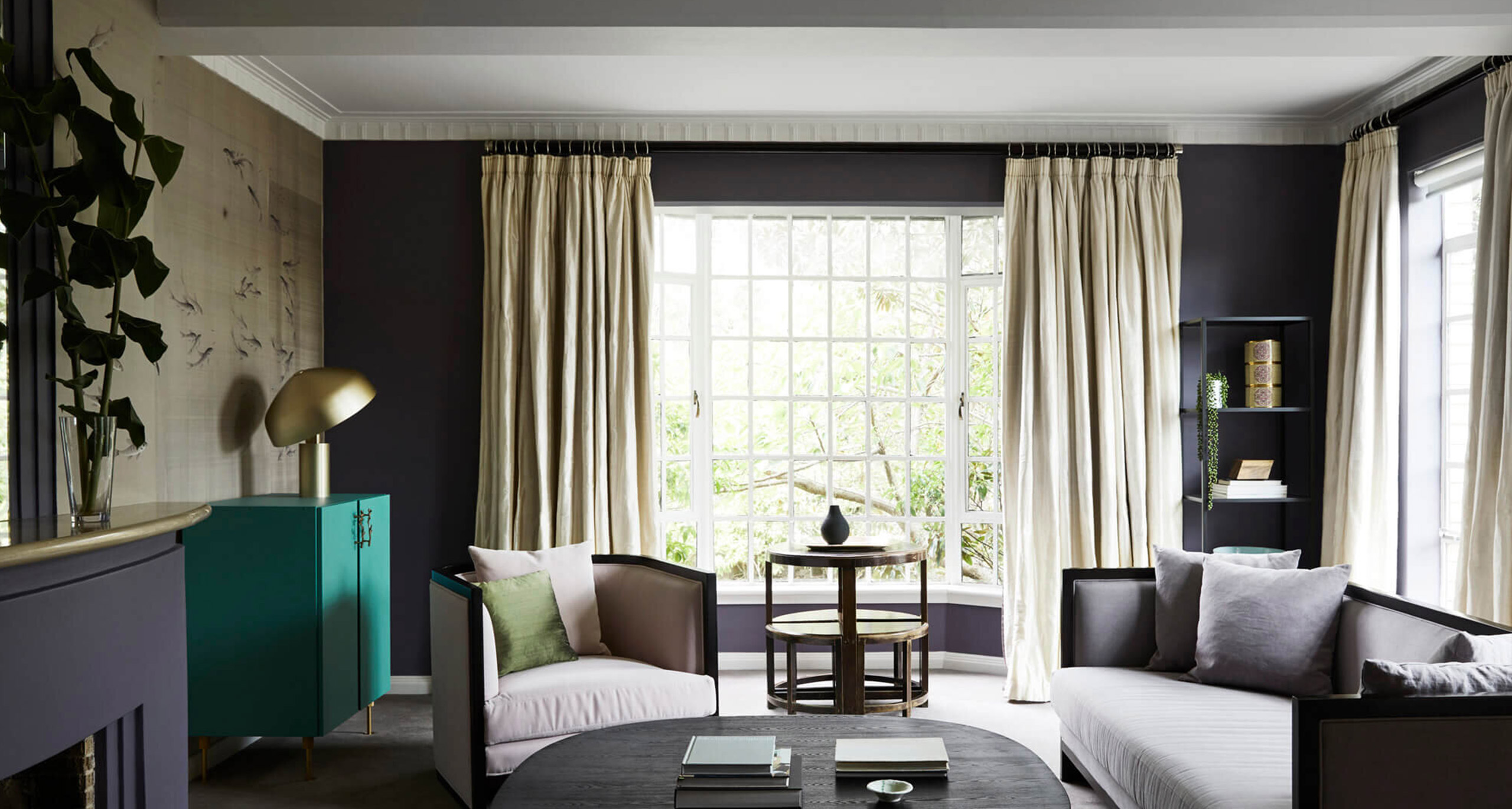
The double-fronted Edwardian façade has been retained and improved, and the centrally positioned front door opens onto a corridor with generous sized rooms on either side. These front formal rooms have been opened up and had walls removed to facilitate spatial flow, which resonates with the openness of the back addition. To the left of the passageway are the formal sitting and dining rooms and, to the right, a study and guest bedroom with en suite. The original Baltic pine floorboards have been stripped back and Black Japan stain applied. Conversely, the walls and ceilings have been painted Dulux Natural White.

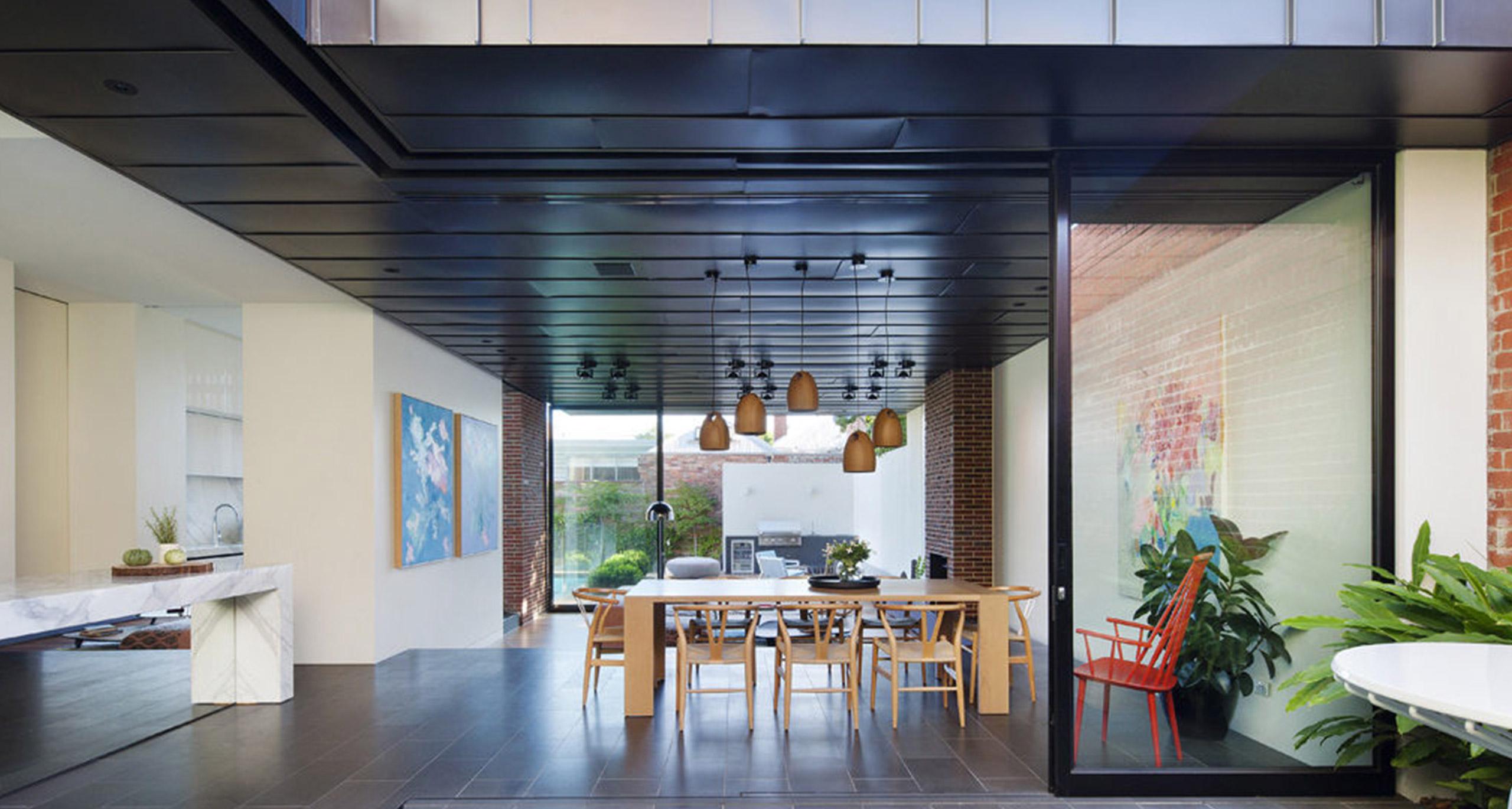
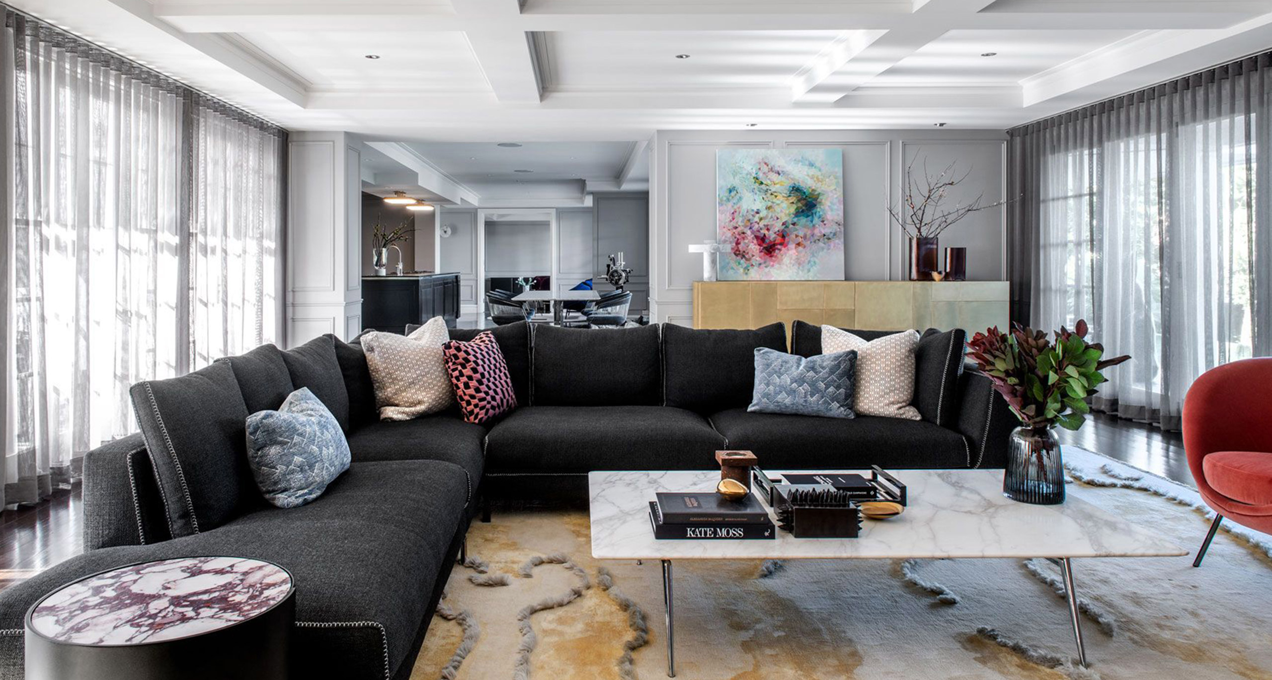
Furniture is spare and elegant; for example, the formal sitting room is a perfect showcase for a Mags sofa (Hay, Cult) and red wire chandelier (Fenton and Fenton) and the dining room features a collection of Tom Dixon pendant lights (Beat, Dedece) over an oak dining table (from Heal’s London) and Møller chairs (#71, Great Dane). Then it’s through to the new addition, where Gibson’s design really shines. The juxtaposition of light and materiality meet harmoniously in this expansive area with many architectural products utilised for both the interior and exterior. For example, basalt tiles laid throughout the meals and kitchen extend to the exterior courtyard, which morphs into an outdoor room, and dark zinc cladding on the two-storey new exterior becomes ceiling tiles throughout the ground floor interior (VM flat lock panels, Umicore).

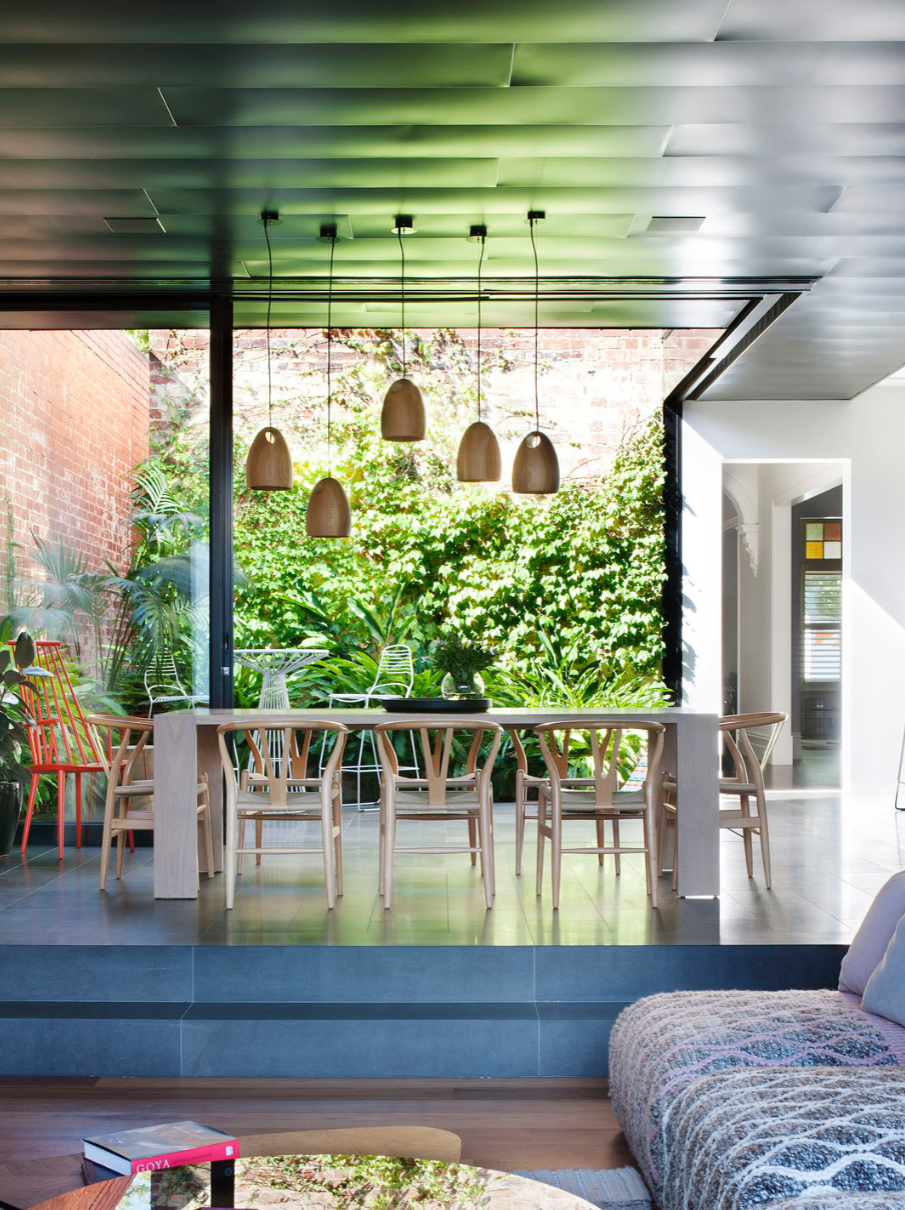
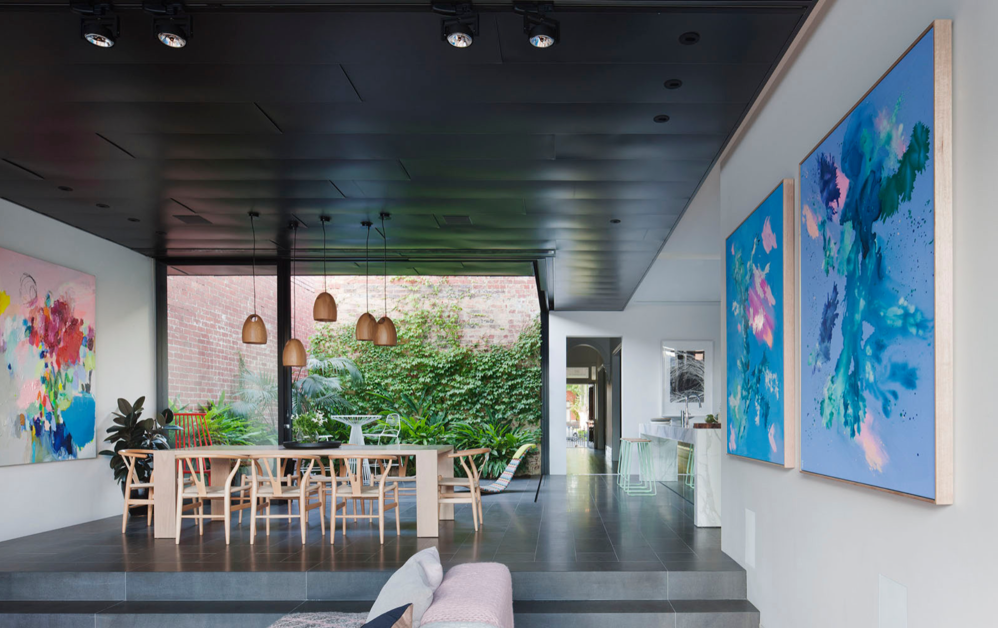
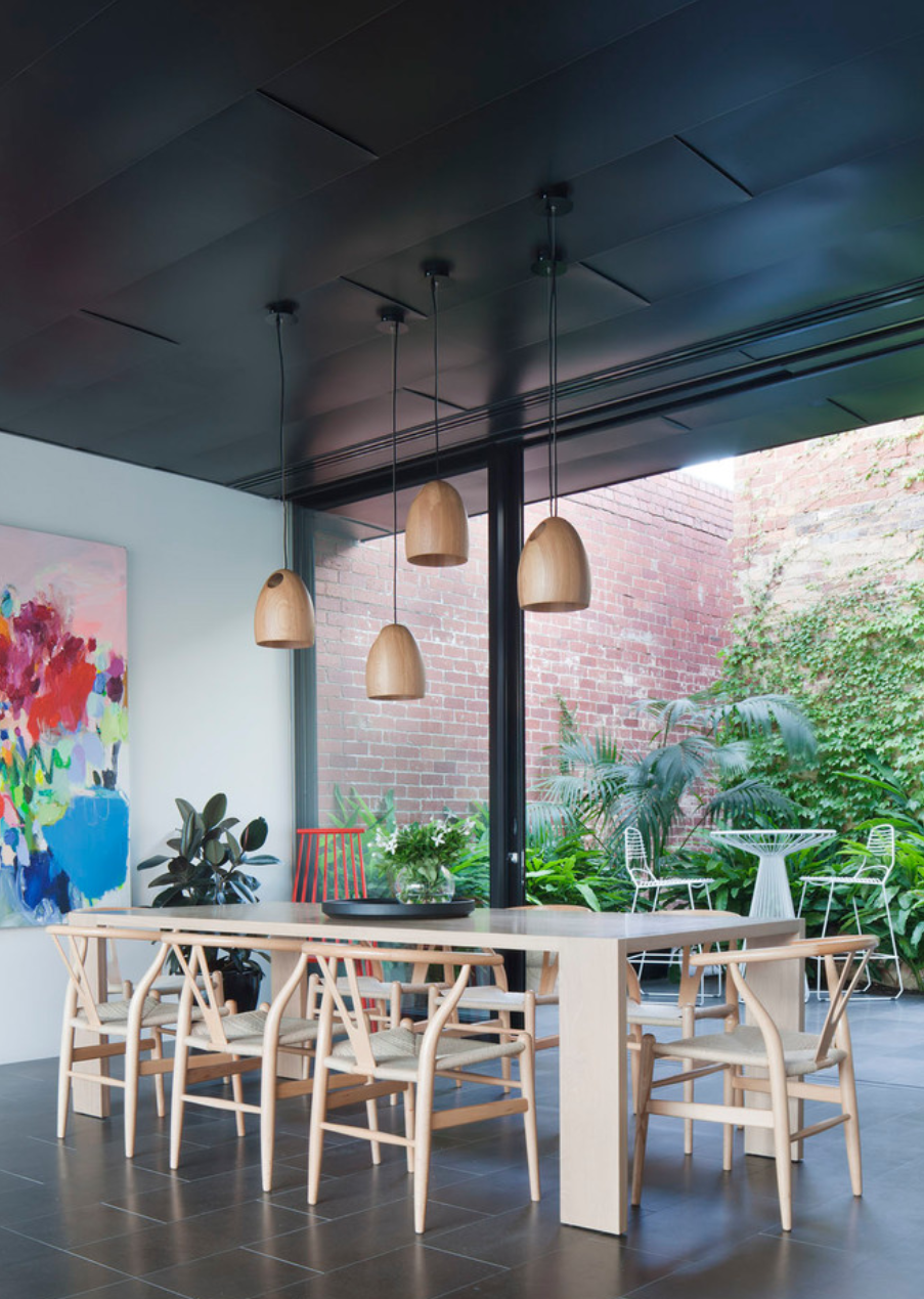
The courtyard, positioned between the old and new premises, is pivotal to the design. It allows light into the addition, while showcasing the original brickwork of the back wall of the established Edwardian house and becomes a conduit between the two buildings. Innovation has been an important part of this project and the floor-to-ceiling glass sliding doors that surround the courtyard are a fine example.

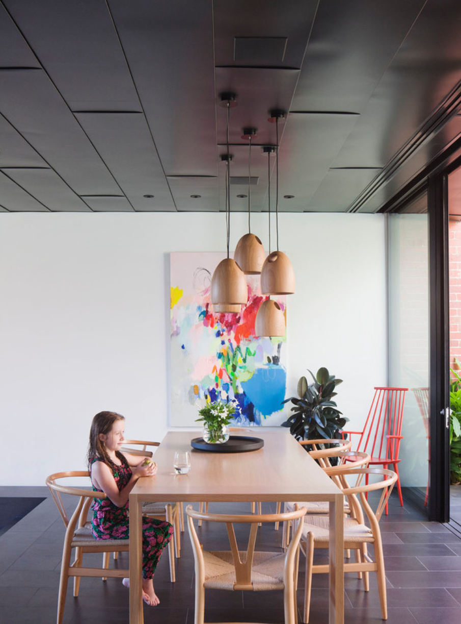
Gibson and his manufacturer developed a unique design where the tracks and subsills of the doors are flush with the tiled floor, so that, when open, there is a seamless transition from one area to another. This application has now become a signature feature on other Gibson projects. Next to the courtyard is the casual meals area, which features a grouping of five pendant lights (Oak, Ross Gardam) above a dining table (April, Zuster) that is surrounded by eight CH24 Wishbone chairs (Hans Wegner, Cult).

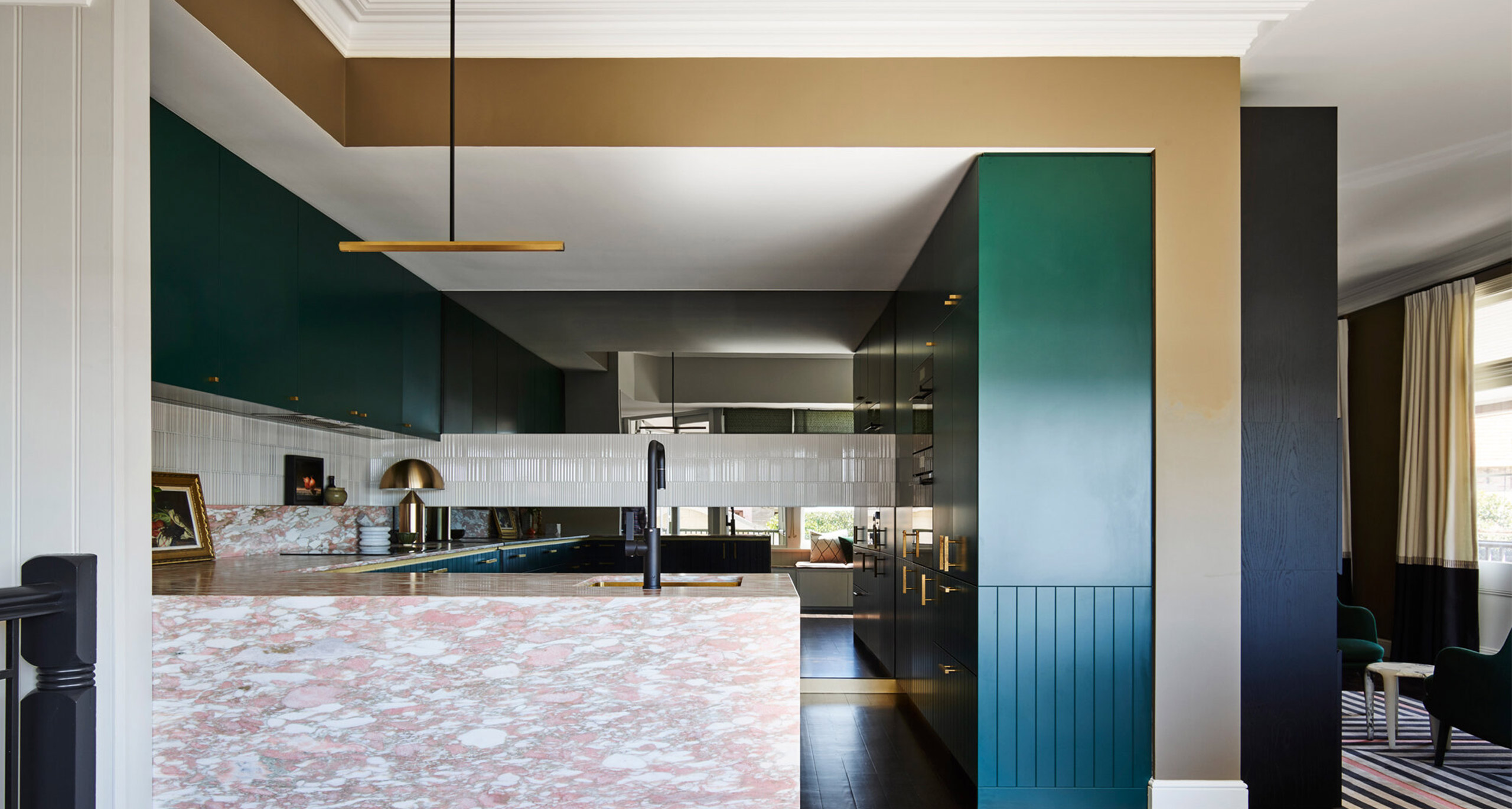
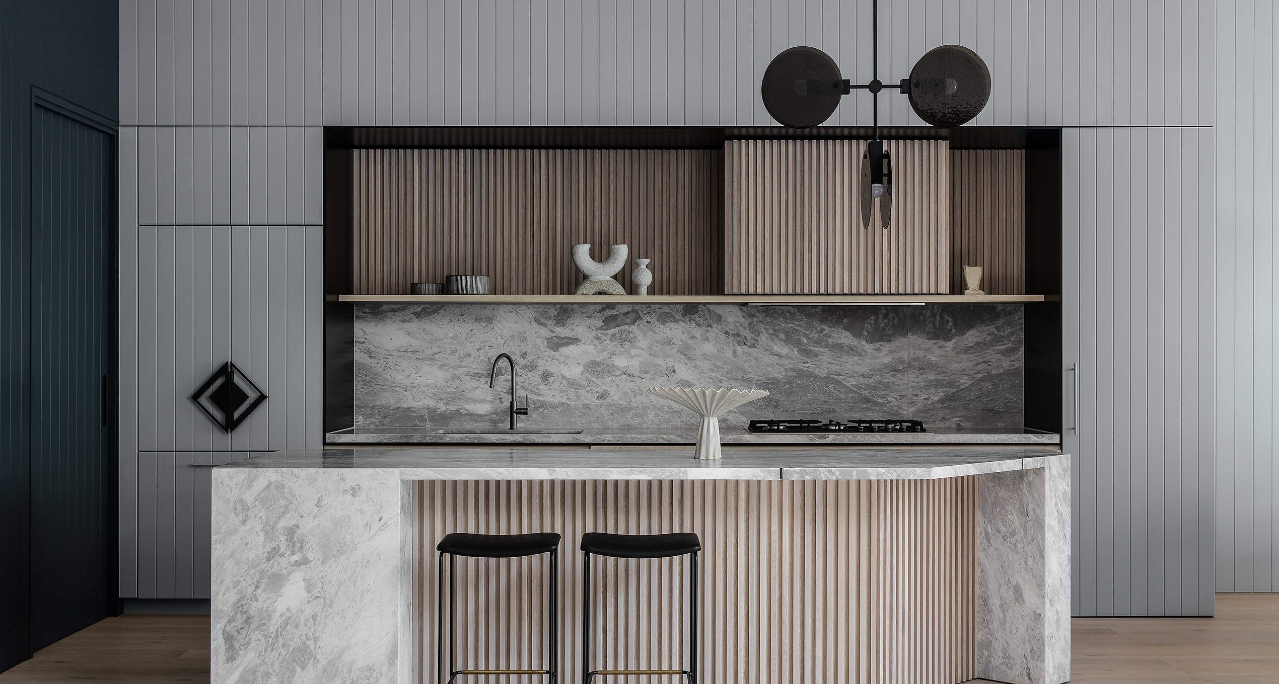
Opposite is the kitchen and here Gibson has employed a clean white modern design. There is a monolithic Calacatta island bench that serves as breakfast bar and entertainment servery, and appliances have been integrated (two Sub-Zero refrigerator/freezers and a Miele dishwasher). It is, however, the stainless steel Wolf oven with ubiquitous red knobs that is the statement piece. All the services and utilities have been placed along and behind this kitchen wall with a powder room at one end and pantry at the other. Across from this is another smaller kitchen work area complete with dishwasher and laundry.

Moving to the back of the extension is the casual entertaining space that has been stepped down from the meals area. Included in the furniture grouping are a Mangas Space Module sofa (Patricia Urquiola, Hub), Sullivan coffee table (Rudolfo Dordoni, Dedece) and Bell floor lamp (Tom Dixon, Dedece). A wooden floor (re-salvaged Blackbutt) has been laid from the step throughout the family room, continuing onto the entertaining deck outside. Again, floor-to-ceiling glass sliding windows separate the inside and outside areas and allow total visibility of the outside entertaining space and the small in-ground pool.

Upstairs are the sleeping quarters, accessed by a staircase behind the kitchen. Gibson has utilised this space particularly well, with a combination of an open plan office on the upstairs landing that leads to the master bedroom, dressing room and en suite. There are two more bedrooms and a bathroom linked by a passageway with windows on the exterior wall. From this vantage there is a particularly fine view of the courtyard below.

There is another level to the house, again accessed by stairs behind the kitchen. They lead down to a home theatre room and purpose-built cellar. The latter is rather special, clad in concrete and temperature controlled, of course. Wine racks line the wall and mirrors have been installed at either end of the room to reflect the warehouse table and eggcup stools (Mark Tuckey) and five Nord pendant lights overhead (Satelight, Studio Italia). This is just the place to open a fine bottle or two.

Although this house is named Abstract House with deference to the composition of forms, textures, materials and colours used in the project, there is nothing abstract about the design intention or the resolution. Gibson has delivered a superb project for his clients, one that is sympathetic to site, measured in its materiality and tone, and accomplished in its composition. This project is all about quality and good taste and how the old can influence the new and the new can enhance the old.

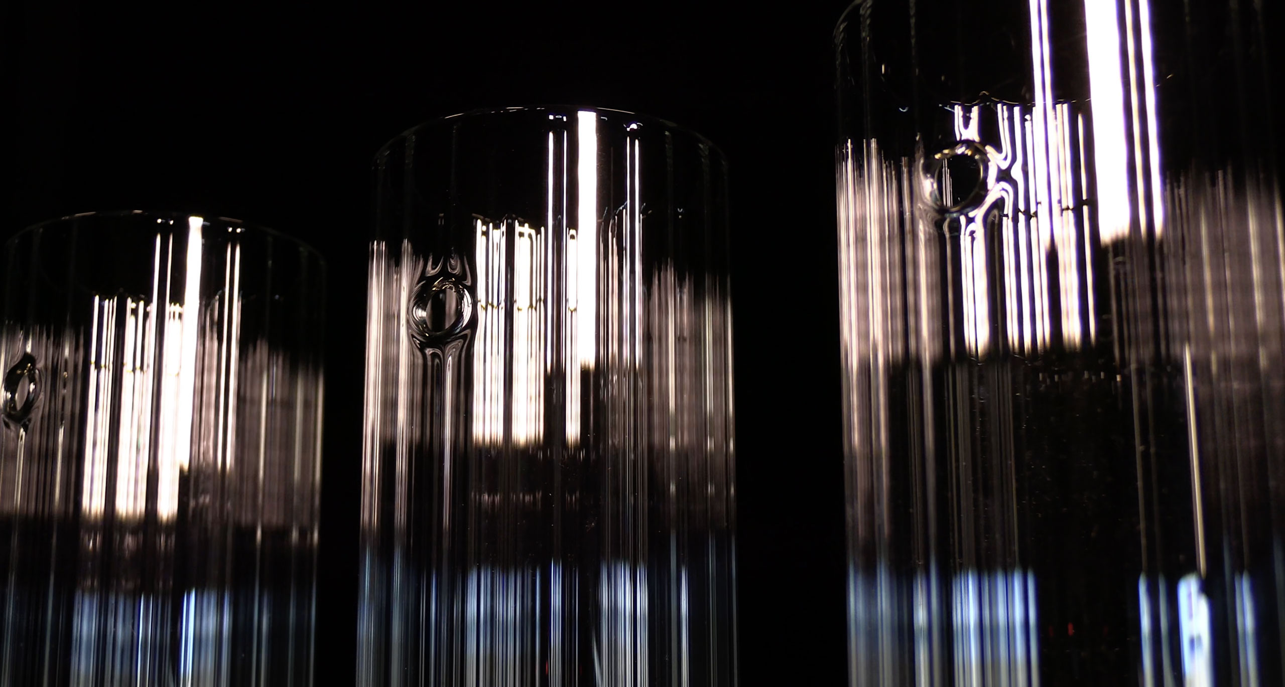
Our Oak Pendant Lights were featured in this project, written by Jan Henderson.

This article was originally featured on AUSTRALIAN DESIGN REVIEW
WWW.AUSTRALIANDESIGNREVIEW.COM

Discover More

Ellivo Architects was tasked with creating a new home for Inland Rail as part of the Australian Rail Track Corporation (ARTC) to house teams delivering thirteen rail projects over seven years.

EXPLORE PROJECT /

Esoteriko were approached to re-envision a beloved home that they had designed two years previously, this time for new owners.

EXPLORE PROJECT /

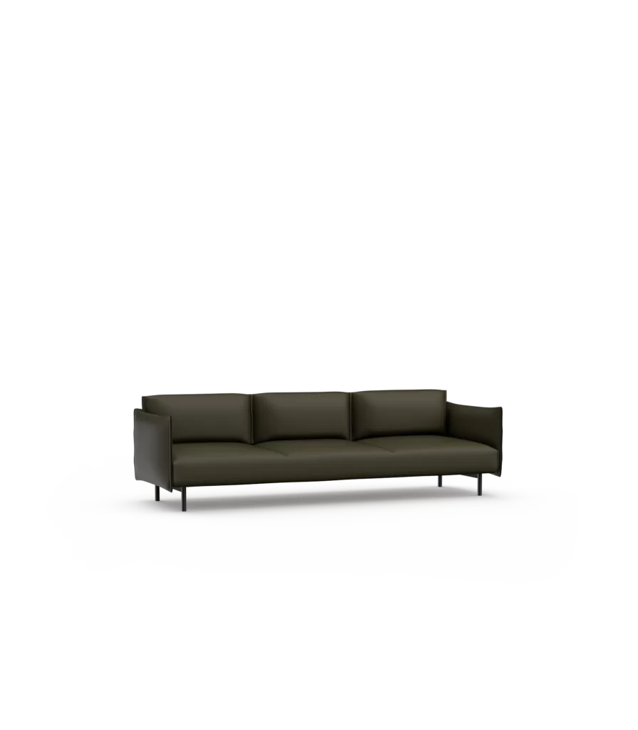
Using design elements form the Adapt Lounge, the Adapt Round Ottoman is a moveable upholstered stool that provides flexible seating for home and office spaces.

EXPLORE PROJECT /

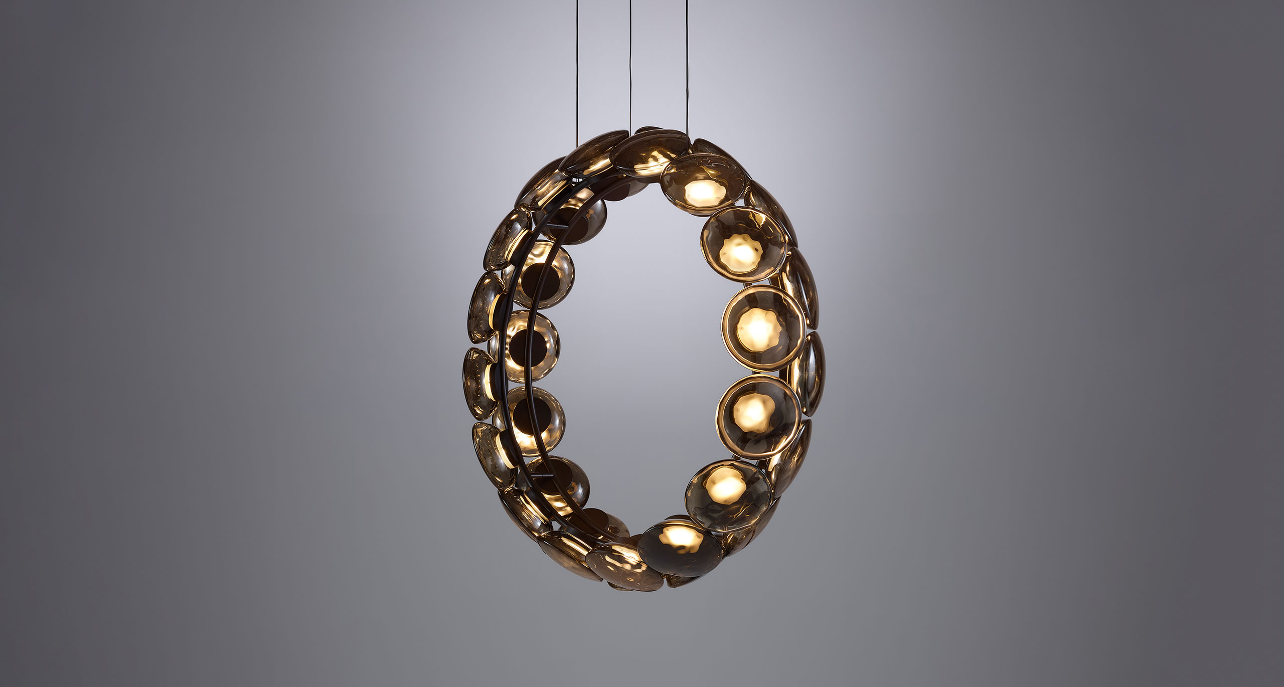
Ross Gardam Previews Ceto Circlet, to be launched at TRANSCENDENCE as a part of Milan Design Week 2023.

EXPLORE PROJECT /

Ross Gardam is pleased to be returning to the upcoming ICFF Exhibition in New York!

EXPLORE PROJECT /

The Ross Gardam Team is excited to announce the Ceto Lighting Collection has been shortlist in the TDF Design Awards in the Lighting Design Category.

EXPLORE PROJECT /

Elevating a Ranch into a Sophisticated, Contemporary Home: The Coral Gables Residence Project

EXPLORE PROJECT /

Rook is a considered collection of stools, subtly inspired by the decorative forms of traditional chess pieces.

EXPLORE PROJECT /

Summoning the presence of the otherworldly, drawn from the deep, Noctiluca’s ethereal form transcends the everyday.

EXPLORE PROJECT /