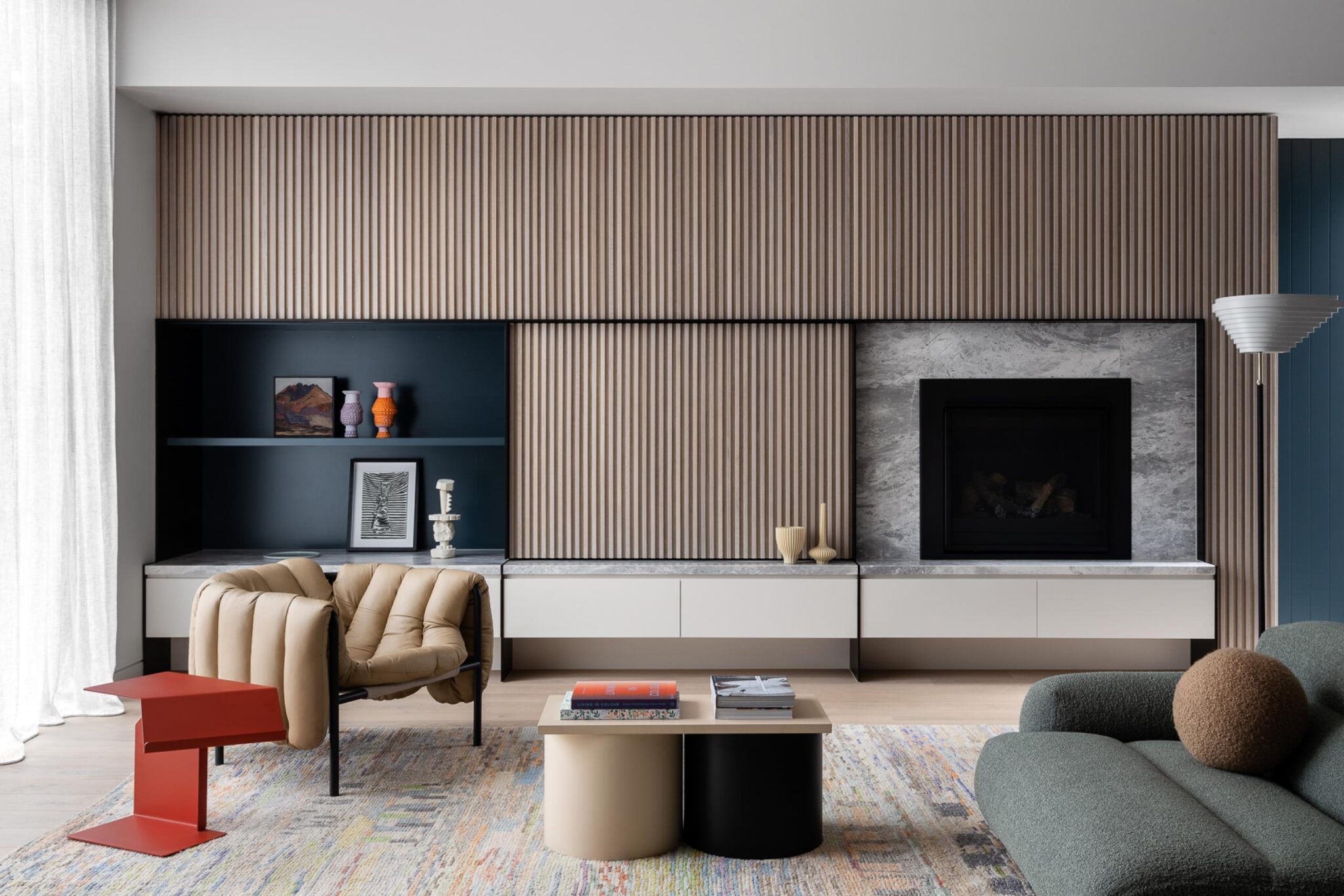
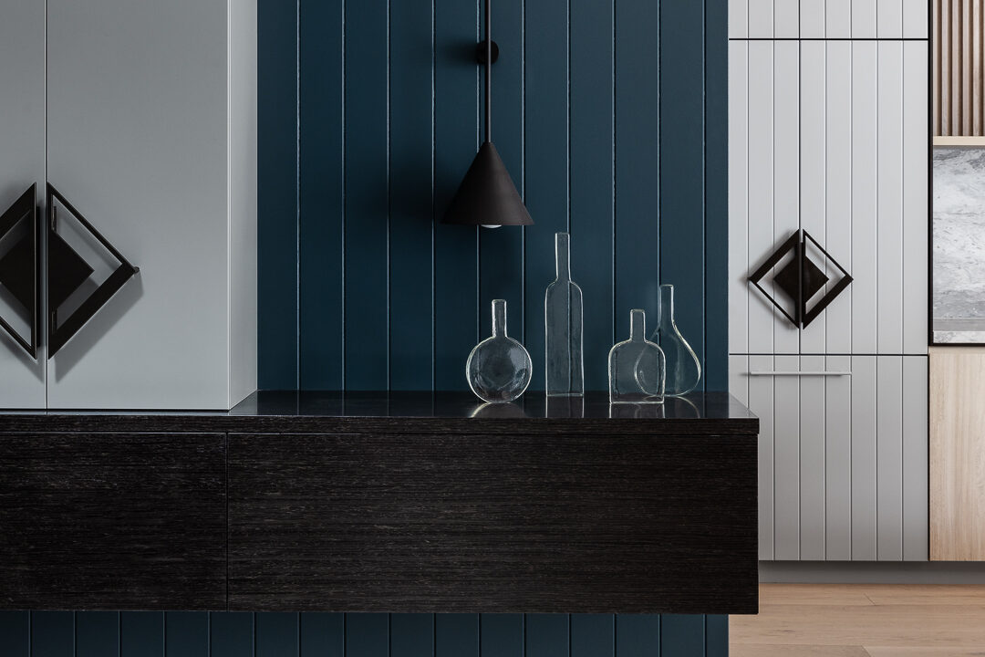
The brief called for two additional bedrooms, an additional bathroom, a rumpus space for the children and for everything to feel calm, open and light. Given the scale of the site, the only real way to achieve this was to go up, so they went up. Blue tones provide adornment and interest, and through repetition, became a connecting thread between all spaces. Colour is also used to delineate one space from another, defining and celebrating this marriage of the old and the new
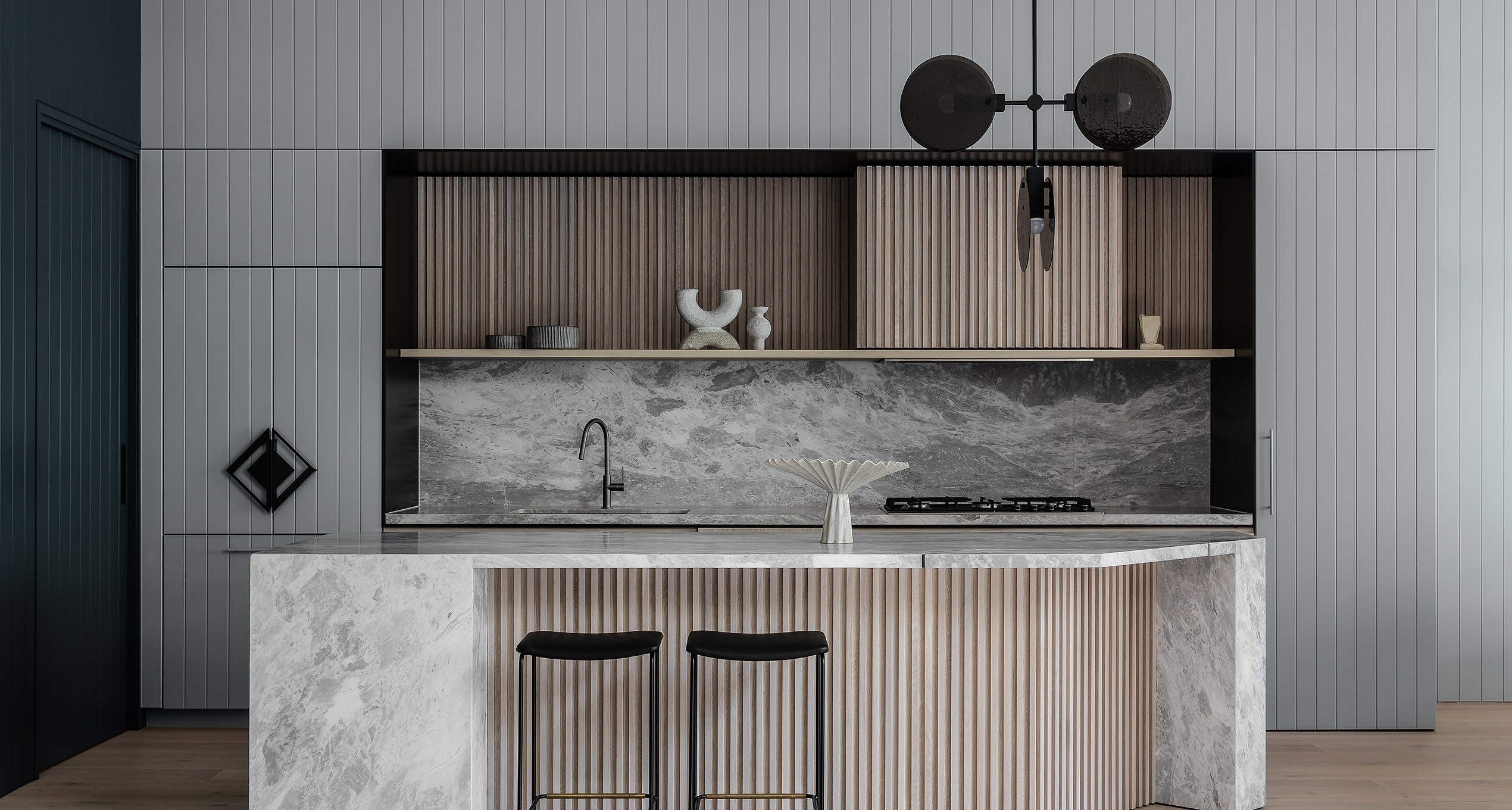
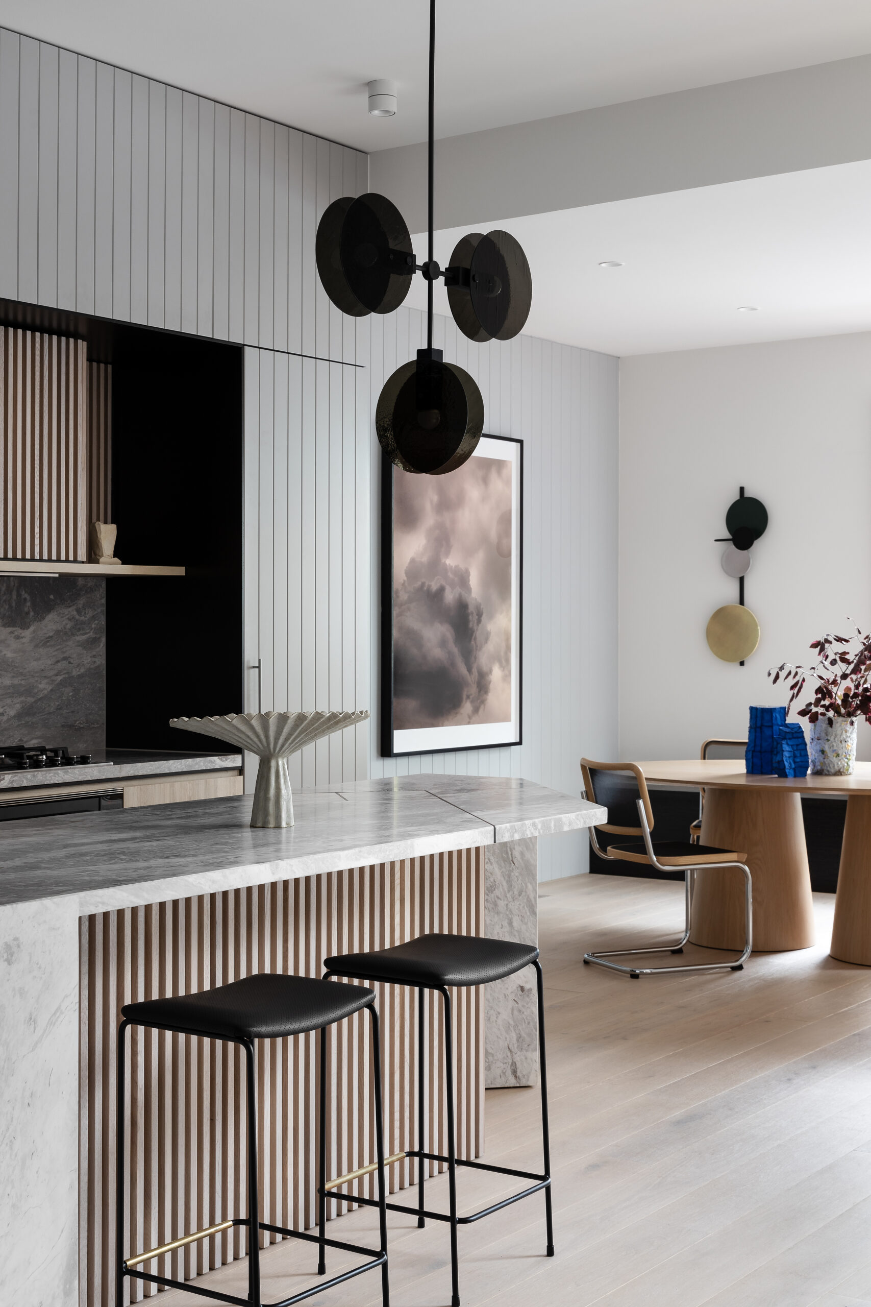
Consistency and repetition through colour also allowed other decorative elements to successfully co-exist. V-groove panelling and vertical timber battens (a contemporary nod to the traditional weatherboard aesthetic) add texture, warmth and ornamentation while also expressing geometric form and thus creating a ‘grid’ motif through joinery.
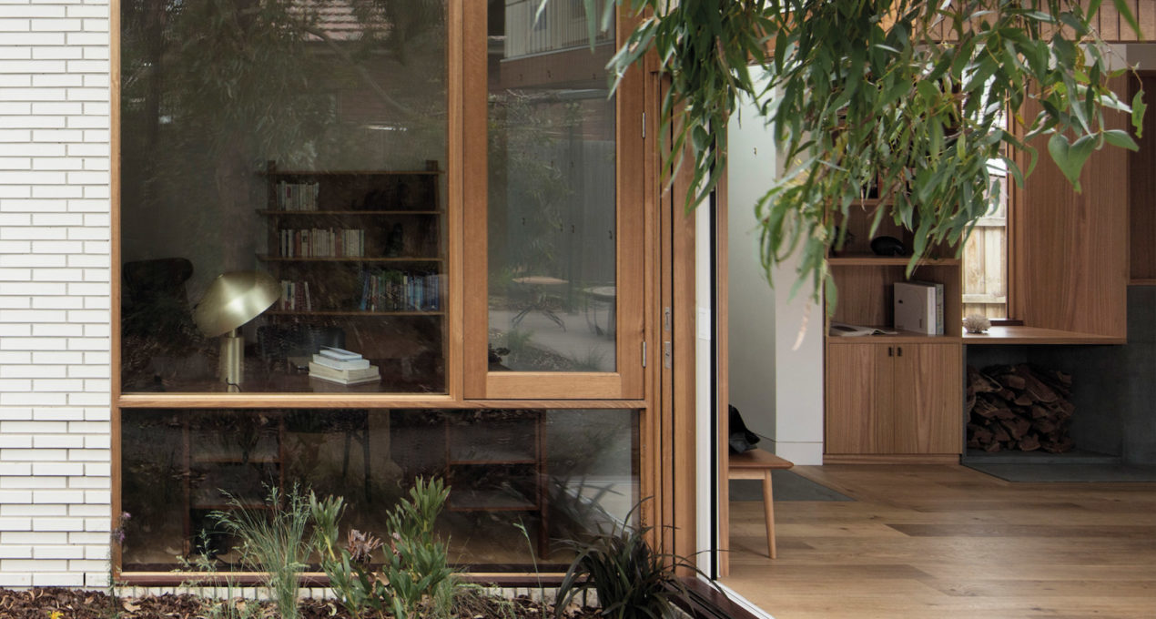
A strong connection between the interior and exterior spaces was achieved by reorienting the kitchen, dining and living towards the garden and pool. No matter where you stand, you’re always facing greenery and in prime position to cannonball into the pool. The back extension also saw the introduction of a ‘floating’ glazed box, designed and positioned so that anyone inside feels completely immersed in the garden.
